Clear 2 is a whimsical to-do list app a decade in the making

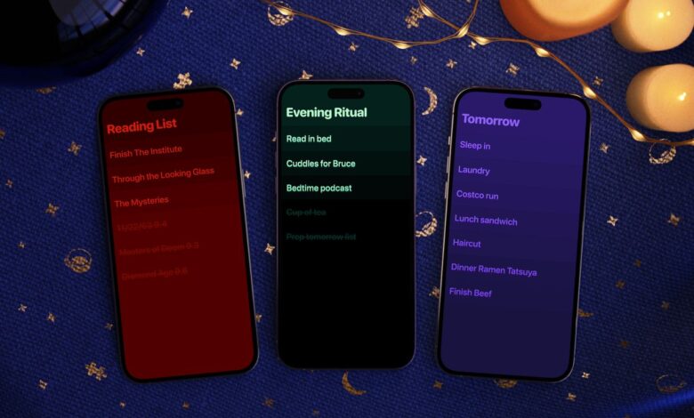
Clear 2 has a huge set of styles, icons, and even in-app sounds you can choose from. | Image: Clear
Clear was one of the most interesting, innovative, and beautiful to-do list apps around. It used clever swipes and gestures instead of buttons and settings, and it had a colorful panache that you just don’t find in a typical productivity tool. Clear was popular, it was cool, it worked well, and it seemed to have a bright future.
That was a decade ago. Back then, co-creator Phill Ryu says, the team stopped working on Clear because it felt… finished, or at least close enough. “It’s so minimalist and simple and charming,” Ryu says now, “it’s not an app where you want to keep adding onto it over the years.” Now, in hindsight, he allows that there was another factor as well. “I think we were all a little burned out.” After years of building…


