Fitbit’s attempt to disappear the button proved why they matter

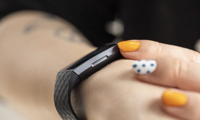
The Fitbit Charge 3 was the first to introduce the inductive button. Confusion ensued. | Photo by Amelia Holowaty Krales / The Verge
It’s easy to see why gadget makers are so fixated on touchscreens. Swiping is intuitive. It enables sleek lines for a futuristic aesthetic. It’s the easiest way to banish bezels and maximize screen real estate. So I understood why Fitbit was chuffed when it introduced the inductive button on the Fitbit Charge 3. Begone side button protrusion, and behold the slim profile of a modern fitness tracker!
This is what an unforced error looks like.
With the Charge 3, Fitbit replaced the Charge 2’s physical button with a smooth groove that you could easily mistake as part of the overall design. Put your finger on the groove, and it activates an invisible touch sensor on the inside of the device. When I initially reviewed the Charge 3, it seemed…


