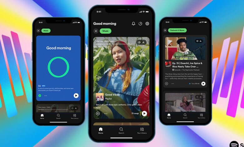
Spotify’s new design is part TikTok, part Instagram, and part YouTube

Spotify’s new homescreen design goes hard on full-screen images and video. | Image: Spotify
Spotify is redesigning the core homescreen of its app, trying to make it easier for users to find new stuff to listen to — and watch. The new design goes heavy on imagery and vertical scrolling, turning your homescreen from a set of album covers into a feed that much more closely resembles TikTok and Instagram. As you scroll, Spotify is also hoping to make it easier to discover new things across the Spotify ecosystem.
The new look, which Spotify just announced at its Stream On event, is clear evidence of the kind of company (and product) Spotify wants to be. Over the last few years, it has invested heavily into podcasts, audiobooks, live audio, and more, all in an attempt to be more than just a music app. The company also wants to be a…


