Summari pivots to AI-generated link previews that really click

Summari took a shot at making article summaries on demand a must-have tool for the overloaded reader. But a year later the startup is leaving that model in the dust for a new, and in retrospect way better, use for its summarization service: link previews. And once you give them a shot, you may find them hard to do without.
The original use case had users feed a URL to the service via browser extension, and Summari would generate a summary, naturally, in just a few seconds. Cool, but as they soon found out, it wasn’t enough to make users rely on it.
“Consumer behavior is really hard to change,” admitted Summari founder and CEO Ed Shrager in an interview with TechCrunch. “No one should have to click a button. People loved it, but we never figured out how to monetize it.”
It makes sense: while it’s nice to have a short version of an article now and then, I can’t say I would pay a buck a month for it. Generally if an article is too long for me to read I skim it or save it for later. No newfangled AI is going to change my hidebound habits.
But Summari pressed on and as it learned more about what its tech would be useful for, it improved the tech itself. What I saw from the company last year was “V1 — and we’re probably on V100 now. We own and do everything ourselves, we just have a lot more control over everything, from quality to speed to accuracy.” Just this week, in fact, a new version of the model with triple the data is coming online and showing further improved results.
Getting to a certain level of quality opens up the possibility of automation, and soon the possibility of automating content summary for websites that publish a lot of content started making more sense than doing it on demand for readers. Of course you still have to find a way to make those summaries useful. (Disclosure: Former TC writer Anthony Ha went to work at Summari investor Eniac a while back. Maybe this was all his idea.)
What the company landed on is link previews. When you have a link, like this one, hovering over it doesn’t usually do anything. There are some plugins that add stuff, and some shopping sites will do a popup, but generally it just changes your arrow to a hand and maybe shows the target URL in the status bar.
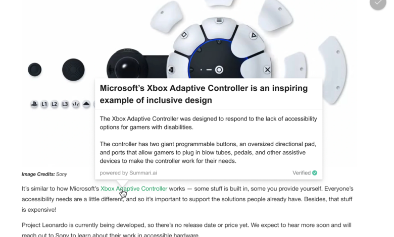
What Summari does is empower every link with a super-succinct AI-generated preview. So the link halfway down this post becomes this:
A Summari link preview as it would look on a TechCrunch article.
On mobile you would tap a little icon next to the link — not ideal, Shrager admitted, “and I’m constantly fighting with my product guy about it.” But you don’t want to interfere with normal link operation so options are limited.
Here are a couple more examples Summari generated for me in text form (just imagine them in a fancy box like the Xbox one above):
Task force proposes new federal AI research outfit with $2.6B in funding
The National AI Research Resource proposed the formation of a new federal organization with $2.6B in funding that would make AI research and development more accessible to American scientists.
The organization would make available computational resources, data, testbeds, algorithms, software, services, and networks to AI researchers.
Funding for the new organization would need to be allocated by Congress, and the final report estimated that the organization would need $2.25B over 6 years to get started and $60-70M per year for ongoing operations.
With new funding, Atomic AI envisions RNA as the next frontier in drug discovery
Atomic AI, which uses machine learning to explore the potential of RNA in drug discovery, raised a $35 million series A round.
They have developed a machine learning model that can accurately predict the structure of RNA molecules based on a limited set of data.
They have since improved their model and are using it to pursue their own drug discovery program, which produces candidate molecules that might work to treat conditions that are drug resistant or notoriously difficult to treat.
Having written the articles, I think they’re pretty solid summaries, but brief enough that they (hopefully) pique your interest. Not everyone goes through and clicks links in an article, because who knows what’s even relevant? Are you going to open 10 tabs just to find out? Or will you try to guess from the URL? The popup seems pretty nice to me, and it only appears when you want it to:
Animated example of a Summari popup.
Here, try it live on this post — you may or may not care about football salaries, but you can see it pop up and disappear. That appearance is custom, too; the length of the summary, bullets, whether and when it’s triggered, all that can be changed. So what happens when link previews get this rich AI summary treatment?
“We’re seeing like 50 percent more pageviews,” said Shrager. “I’m a pretty analytical person and I was nervous about what we were seeing, because it’s a little counter-intuitive. But Wikipedia did this, and it was very successful. It reduces the cost of exploration to the user.”
By getting a bigger hint as to what they’re hovering over is going to be, it reduces the hump of “should I click this or not?” World’s smallest hump, sure, but if you told a web publisher you could increase clicks by a single percent — let alone 50 percent — they’d jump on it. Time on site and engagement are valuable metrics, and finding ways to increment those upwards is a big part of any product manager’s job.
Different links, like affiliate links, can provide different previews, for instance pros and cons of a product summarized from the last hundred reviews. Or external links can be left naked — perhaps (just being honest) to prevent the same clicky effect from benefiting them.
Shrager noted that they’ve done a lot of work under the hood specific to making sure summaries don’t exhibit the kind of “creativity” language models are infamous for — names, dates, quotes and other things are always retained, for instance, and changing wording is limited to places where it won’t change meaning. “All of our valuable IP is all the know how and knowledge that are before and after the AI model,” he said.
Ultimately, although users benefit, Summari’s customers are now website operators. The company charges a flat fee for access to the tool and then a small usage fee.
“If your average article has 1,000 words, and you have five of them, we summarize 5,000 words and write 500, and we charge maybe 50 cents,” Shrager offered as a very loose example of the scale. “We try to make the overall price de minimis so it’s not a block to a sale — the only way we can scale fast is to figure out big distribution channels.”
After its initial partners, Summari is set to go live on a major academic publisher and large news site, both unnamed. “We’re definitely noticing FOMO across the industry,” Shrager said. “There are people sniffing around, starting to see the value. There’s a natural network effect because backlinks are being summarized. Once TechCrunch has summarized using us, you wouldn’t want to turn it off and do it all over again.”
I suggested that, with major tech players like Microsoft and Google making huge plays in AI, the company should not be surprised to get an offer or two slipped under the door. After all, summaries like these would be great in search engines or an algorithmically curated news site. But Shrager said they aren’t looking for a quick exit.
“My job is to maximize value for shareholders. If I got an enticing offer from Google or Yahoo, it might be of massive strategic benefit… I’m not foolish, I’d go for that. But everybody here is going for the big win.”
Summari pivots to AI-generated link previews that really click by Devin Coldewey originally published on TechCrunch


